Plinth
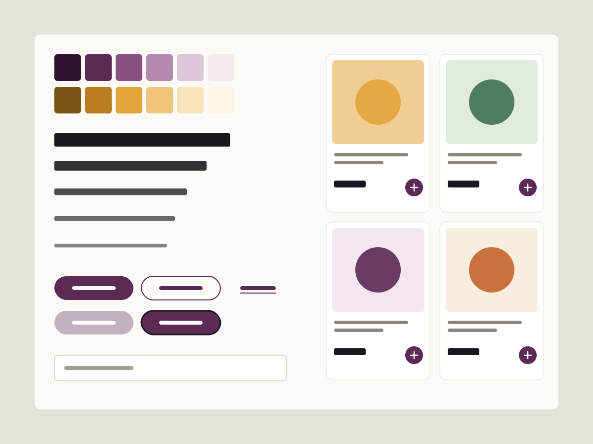
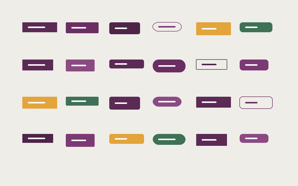
A grocery marketplace that had 24 kinds of button now builds from one library of tokens and components shared by design and code.
Sample project. Replace with real work.
Problem
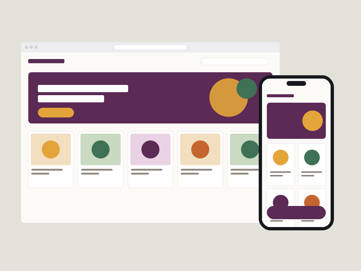
Marketday is a grocery marketplace that grew fast and designed every new screen from scratch. By the time I joined, the product had drifted: different greens for “in stock”, product cards rebuilt every sprint, and handoffs that turned into long threads about spacing (sample context for this placeholder project).
Designers and engineers had no shared source of truth, so every screen was rebuilt slightly differently and the product felt less trustworthy than the groceries it sold.
Research
I audited every live screen and collected each unique component, then interviewed six designers and engineers about where handoff broke down (sample research).
I rebuild the product card every sprint because I can’t find the last one. And even if I could, I wouldn’t know which one is right.
- Twenty-four button styles in production, from eight colours and six corner radii.
- Nobody owned the library. It had components, but no one could say which were current.
- Names differed between Figma and code, so every handoff needed a translation.
User flows
A design system’s users are designers and engineers, so the flow I designed for was theirs.
A designer or engineer needs a button, a card or a banner.
Five buttons and a small set of parts: few enough that people know what is in there.
Use a variant, or compose cards, rows and banners from parts instead of saving a new component.
Semantic names like action-primary, identical in Figma and in code.
No translation step, so the handoff thread is about the product, not spacing.
Key decisions
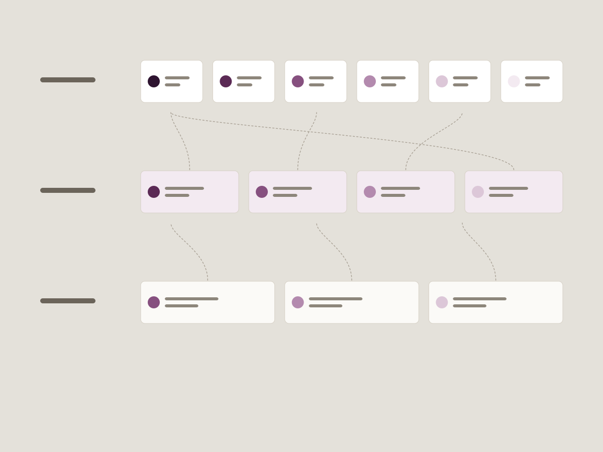
Three tiers of tokens
Primitive tokens (plum-600), semantic tokens (action-primary) and component tokens (button-bg), with components only ever using semantic ones.
One flat list of colours and sizes.
Trade-off. More to learn on day one. In return, a rebrand or dark mode becomes a change to one tier instead of every screen.
Fewer variants, more composition
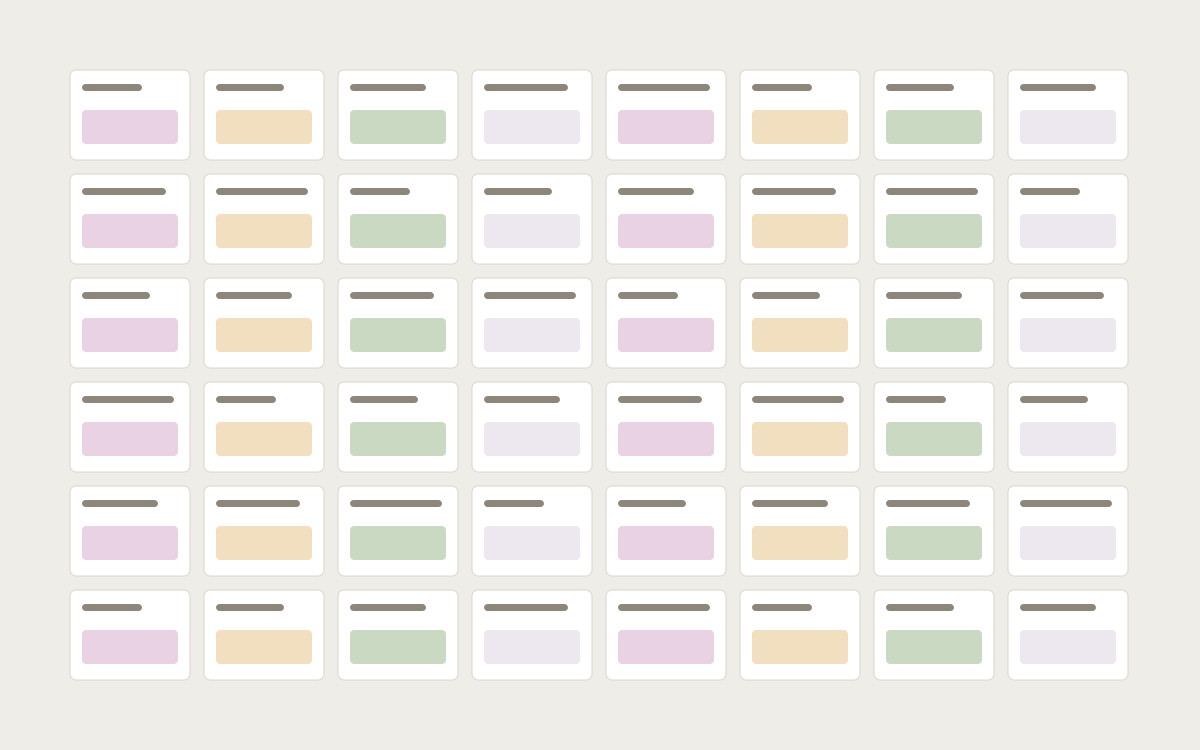
Five buttons and a small set of parts that combine into cards, rows and banners.
A component for every screen's variation, which the team first asked for.
Trade-off. Designers compose a little more. The library stays small enough that people actually know what's in it.
The rejected direction was the library the team first asked for: every variation from every screen, saved as its own component. It would have made the first month faster and every month after it slower.
Solution
Plinth ships as a Figma library with variables and a coded package documented in Storybook. Token names are identical in both.
I used Claude Code to generate the first pass of token files and Storybook stories from the Figma variables, then reviewed and corrected them in VS Code. It saved days of typing, and it found three variables I had named inconsistently.
Outcome
Placeholder results until real ones are supplied.
- 24 button styles became 5, and 11 product-card versions became 1 with options (sample).
- New screens went from design to code in about half the time, e.g. 6 days to 3 (sample).
- The library has an owner and a monthly review, so it stays current (sample).
What I’d do next
- Dark mode, which the semantic tier was built to make cheap.
- Usage analytics on the library, to retire components nobody uses.
- Contribution guidelines so product designers can add to Plinth without waiting for me.